Instead of writing about the artists that currently inspire me that I had planned for this newsletter, I decided to first relate how I think location and medium (along with an exceptional artist) have been influences and inspiration over the 45 years since moving to this incredibly beautiful part of the country.
Location
My first painting medium was watercolor and, as I described in the last newsletter, my first inspirations were expert and well-known watercolorists, almost all of them at the time from the east coast. I collected books by famous west coast watercolorists like Millard Sheets and Rex Brandt who had lots of great tips and techniques to offer, but despite their great work, they were not as appealing to me as that of the easterners I admired.
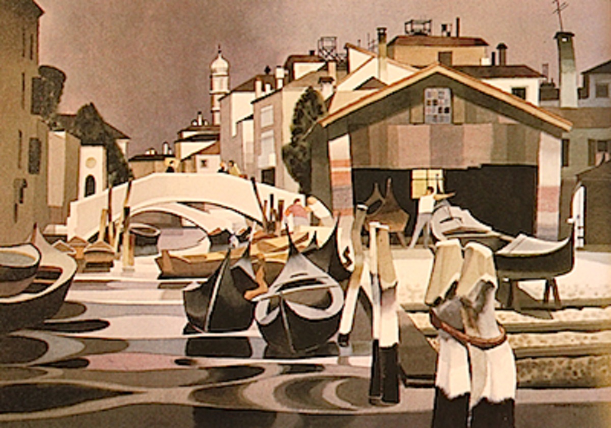
Over those first three or four years after graduation from Dartmouth I was lucky to be able to see lots of superb work by other masters of the medium in books, shows and occasionally in galleries. In 1973, because I was selling some paintings and playing banjo steadily three nights a week, I was able to afford a six-month, two-days-a-week daytime watercolor workshop at the National Academy of Design in Manhattan with Mario Cooper, then president of the American Watercolor Society. Interestingly, Cooper won the Gold Medal of Honor in the annual AWS show during the period I happened to be attending the workshop. I tried searching for that painting to show one of the best of his works but without success. Aptly named Cormorants I think, it depicted a number of black cormorants standing on a pier with the foreground water painted almost identically to the water in San Trovaso below.
Cooper’s style was not what I was particularly interested in (plus he was a bit of an arrogant taskmaster), but his emphasis on composition and design and stylized technique did sink in, at least for a time. It seems to have somewhat shown up a couple of years later after moving to San Francisco when I painted The End Of Mission in addition to a couple of other paintings of buildings using a similar, not-entirely realistic, style. What I remember most after the six months was his mantra, “You should paint three kinds of paintings [in sequence] — one to sell, one to show, and one for yourself.”
The End Of Mission was probably “one to show.” The subject pictured is The Audiffred Building, one of the few buildings spared, by bribe no less, from dynamite following the 1906 San Francisco Earthquake — “…the Audiffred Building was saved [by] the bartender of the Bulkhead, the drinking establishment then occupying the building, bribed the firemen with the offer of two quarts of whiskey apiece and a fire cart full of bottles of wine.”
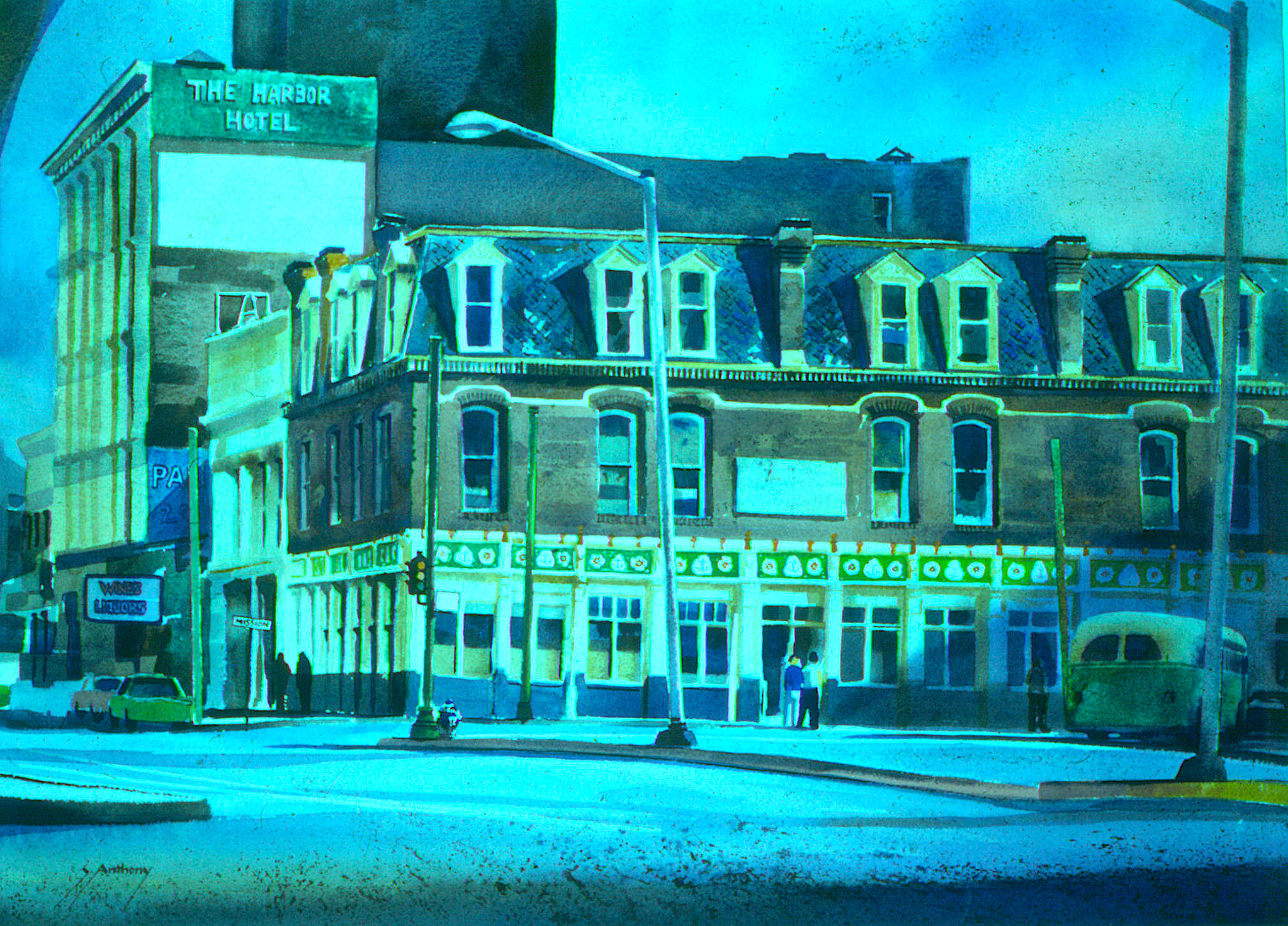
Since my painting of it, the building has been completely renovated and now houses an upscale restaurant, Boulevard, and has offices on the two floors above. It is still a really interesting subject although I think its original dilapidated state was more attractive from an artistic point of view. An interesting side note is that five years after I painted this historic building and location I would be playing intermissions five-nights-a-week (from 1979 to 1982) for the Turk Murphy Jazz Band at Earthquake McGoon’s, whose location turned out to be the first floor of the Harbor Hotel at the far left of the painting! As for the painting itself, I unfortunately have no clue to where it now lives.
The move from New Jersey to San Francisco was almost certainly the greatest overall influence on my artwork to date, and the west coast is the greatest source of inspiration for me still. At first, however, the landscape and architecture were so different that it took a number of years before my west coast landscape paintings did not, “…look like New England” as John Pence of the John Pence Gallery told me when he turned me down for acceptance as one of his gallery artists. The lesson learned is that it usually takes awhile for the “feel” of a place to sink in and be reflected in an artist’s work. I think probably after this many years it finally has sunk in!
A New Medium and One Artist
I started painting with acrylics a year or so before moving to San Francisco. Although they had been available to artists for many years, they were new to me . Water-based acrylic paint provides the combined working properties of both watercolor and of oil with the benefit of fast drying (for impatient painters like I was at the time) and permanence — it can be layered without dissolving what’s underneath. Plus, the palette and brushes are easily cleaned up with water, so volatile, toxic and smelly solvents are unnecessary.
My first attempts were to use acrylic paint in a traditional watercolor technique since that was what I was most familiar with — thinned with lots of water on watercolor paper and leaving the white of the paper for the lightest values. The result of this technique is pretty much indistinguishable (at least from a distance — close up, acrylic dries with a bit of a sheen) from a traditional watercolor painting. I have to confess that I may have first tried them because acrylic paint is a lot cheaper than high quality watercolor paint for the amount of “real estate” that it covers . One drawback, however, is that once dry, acrylic artists’ paint cannot be re-wet for use like watercolor tube paint can be, so any left on the palette may be wasted. A workaround for this that I discovered and still use is to squeeze acrylic paint into wells in ice-cube trays and spray the paint lightly with water and cover the trays tightly between work sessions. The acrylic colors stay usable this way for a month or more.
Up For Repairs is an example of one of my early “acrylic watercolors.” I wish I could find it — I am pretty sure I have it stashed away somewhere!
I am not entirely sure why, but at some point I was inspired to overcome the purist watercolorists’ aversion to using opaque white paint and I tried the completely different and conceptually opposite technique of using acrylic like an extremely fast-drying version of opaque oil paint. I say “opposite” because, In general, watercolor uses the white of the paper for the lightest values and mostly progresses from light to dark. Opaque media like acrylic and oil, again in general with exceptions, are the opposite in that a painting progresses from dark to light. This influence of the medium is profound.
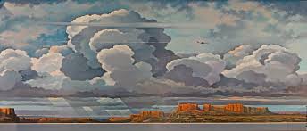
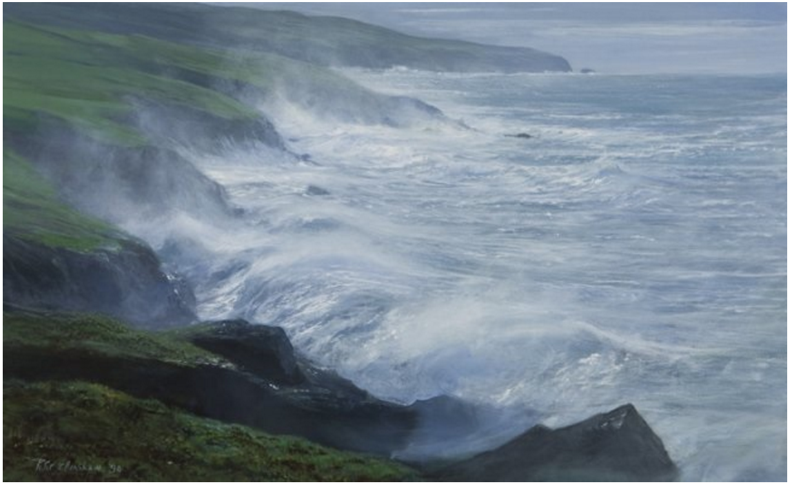
This switch in (or actually additional) technique and approach was probably triggered by seeing the spectacular paintings of Ireland by Peter Ellenshaw (1913-2007) at a show of his at the Connacher Gallery in San Francisco, probably around 1976. Ellenshaw’s large acrylics, especially those of the Irish coast, were awe inspiring to me at the time. I am fairly certain that Kerry Coastline below was one of the paintings in the show. It was huge as I remember, probably at least 48″ wide. Up close, the paintings were very impressionistic with seemingly random dashes, dots, slashes and other marks, but at a distance these textures merged into powerful, almost photographic realism. And, true to the opaque acrylic medium he used, the paintings were obviously built from dark to light.
An Enhanced Medium
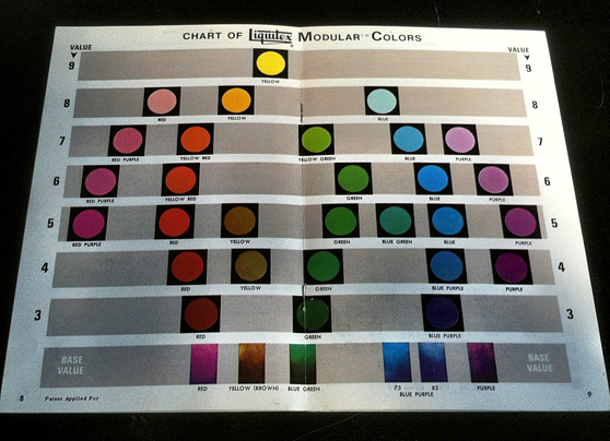
Just before moving to San Francisco I saw an ad in American Artist magazine for a new range of Liquitex acrylic colors, their Modular Color System (MCS). The MCS provided a complete range of colors pre-mixed with white in discrete levels of dark to light value. This system eliminated guesswork in value relationships and made “dirty” colors, that often happen when pure colors of different values are mixed, a thing of the past.
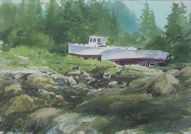
I did a number of acrylic paintings on canvas using the new Liquitex MCS. For quite a few years in San Francisco, even while attempting to make my paintings look less “eastern,” I was still drawing on hundreds of sketches and slides from back East and “Down East” Maine for subject matter. Low Tide Vinalhaven is one of them (and is available if anyone is interested in it).
I continued painting using both watercolor and acrylic (mostly Liquitex MCS paints) until the mid-1980s when a number of circumstances interrupted the flow. Thankfully, music and then computer programming filled the resulting time-gap, a gap that after almost 20 years has been followed by new inspirations to be described next time.
Thank you for reading! I hope you find these pieces interesting. If you are reading these newletters on social media and would like to get them by email, please go to santhony.com to sign up and/or see some of my latest work, leave comments and see previous posts.