New Android App For Artists
Explanation
I have almost always painted from photographs and sketches done on-the-spot that were “memorialized” by photos. Thirty years ago, before digital cameras, I actually worked a lot from slides that I viewed through a dissecting (low-power) microscope mounted on top of a makeshift sort-of light-box next to me. This was cumbersome, to say the least.
The advent and perfection of digital photography, plus the availability of tablets to view the photos, has made artists’ lives much easier. Just the benefit of being able to take lots of shots of a scene without worrying about wasting film and the expense of developing that film is monumental.
One of the main attributes of a realistic painting is the proper placement and composition of big, main shapes based on their value, that is, the light and dark areas of a scene. Because our eyes do not perceive the red, green and blue components of a color equally, the lightness or darkness of a color in nature or a photo is often quite difficult to determine. For example, pure red is actually a middle value even though it seems very “bright.” Experts advise to squint at a scene to minimize details and make the “big shapes” of light and dark more visible.
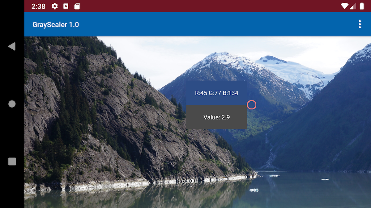
There are a number of “color-picker” app tools that display the not-very-useful-to-artists RGB (red-green-blue) components of a color at any point on an image loaded onto a tablet or phone. This RGB information is useful for computer art, HTML, designing screen layouts, etc., but the apps do not show the gray levels useful for artwork. Another range of tools also available to artists are printed gray-level cards to lay next to areas of a painting that allow the painter to judge gray levels. So, for painters, neither the “color-picker” apps nor the cards are ideal.
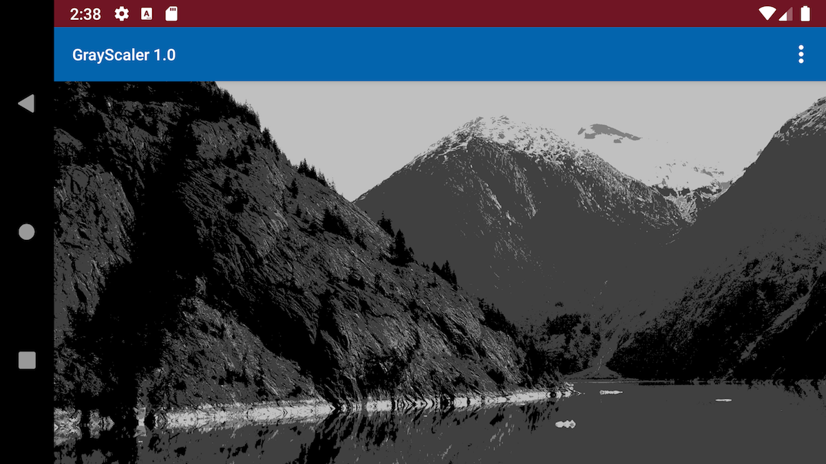
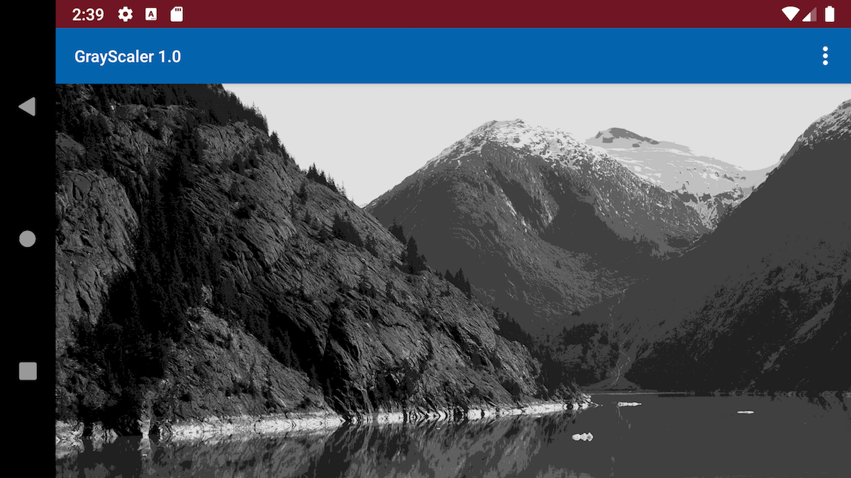
To fill this niche void, I have written an Android (only – sorry iPad users, at least for now) app that displays both the standard RGB values along with the gray value of any point in an image. Normally, gray levels are numbered from 1 (black) to 10 (white). The gray levels displayed in this app calculate the value to one decimal place, allowing you to estimate whether the value is slightly lighter or darker than the standard. In addition, GrayScaler will convert a loaded image to either a 5-level grayscale or 10-level grayscale image. Among other benefits, this feature makes the app ideal for analyzing the value relationships in your own paintings – just take a quick shot of the painting, load it into the app, and convert the image to 5 or 10 levels to see whether the big shapes hold together for a good composition!
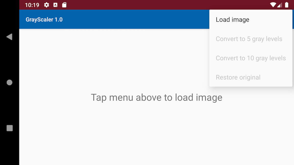
Screenshots
Notes
- When an image is first loaded it will be sized to fit the screen. As soon as it is touched, it will expand to its full size. This may seem alarming at first, but pinching, zooming and dragging are implemented, so you can adjust the size and position of the image any way you like.
- As mentioned above, the normal artist gray levels range from 1 to 10. Any gray level displayed as less than 1 in the app can be considered black and any above 9 considered white. This is an old how-many-spaces-between-numbers problem – there are 10 spaces, in our case gray levels, between 0 (black) and 10 (pure white).
- I am considering adding a “Settings” menu option that will allow sampling an area larger than a single pixel on the screen. For example, a 5 by 5 pixel area. This would make touching the screen less sensitive and provide an ‘average” gray level of a larger area. Right now it is pretty difficult to zero in on a single small detail to get the color and gray level without a lot of poking the screen and trial and error.
Comments are welcome below!
Click on the “Buy Now” button to purchase and download for $2.50
On checkout from Paypal, you will be re-directed to a page with a link to download the Android apk file to install on your phone or tablet. The page also describes how to install the app on your device.
More screenshots may be added…