I was working on a newsletter for this week with the history of why I do realistic artwork but I decided that with over 1000 folks dying almost every day for the past who knows how long, my “story” just does not seem very important right now in the grand scheme of things.
So with that cheery thought, I am just going to make this and probably the postings for the next few months very short, just showing recent finished pieces and maybe some “works in progress” that I hope might bring back fond memories for you of places you have been (or ones you hope to visit in the future) that might cheer you up if you are feeling down while enduring this stressful time, even just a little bit.
Stay safe and well, keep your distance(s) and please, as they say, “Wear a damn mask!”
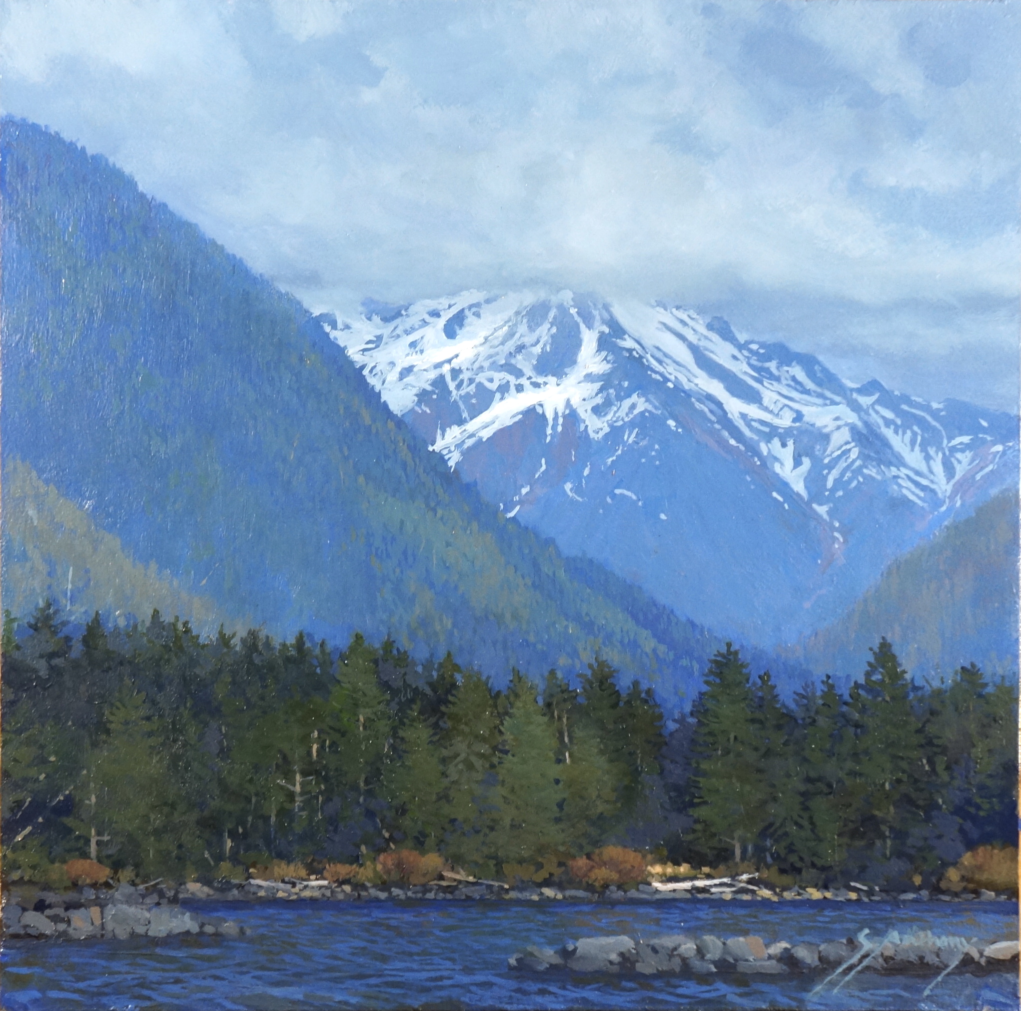
“North of Sitka” Oil on hardboard panel, 12″ x 12″
Thank you for reading! I hope you find these newsletter pieces interesting. If you are reading them on social media and would like to get them by email, please go to santhony.com to sign up as well as see some of my latest work, leave comments and read previous posts.
A couple of my friends asked me why I was writing these blurbs about inspiration. I had to think about that for awhile since I am a mostly self-taught painter and my “teachers” have been mostly impersonal art instruction book authors. The answer boils down to wanting to express my deepest thanks to them for the electric spark they generated to get me started down my particular artistic road. I was never able to actually meet any of the people mentioned so far, but I want to thank them anyway, along with the three artists I mention next.
A New Medium For Me
For over 30 years I almost completely avoided painting in oil. I think in total over the entire time I have been painting I had, maybe, completed three oils. I had always run into trouble because of impatience with the slow drying time of oil paint and generally wound up with something that looked like finger-painting with greenish-brownish-gray mud.
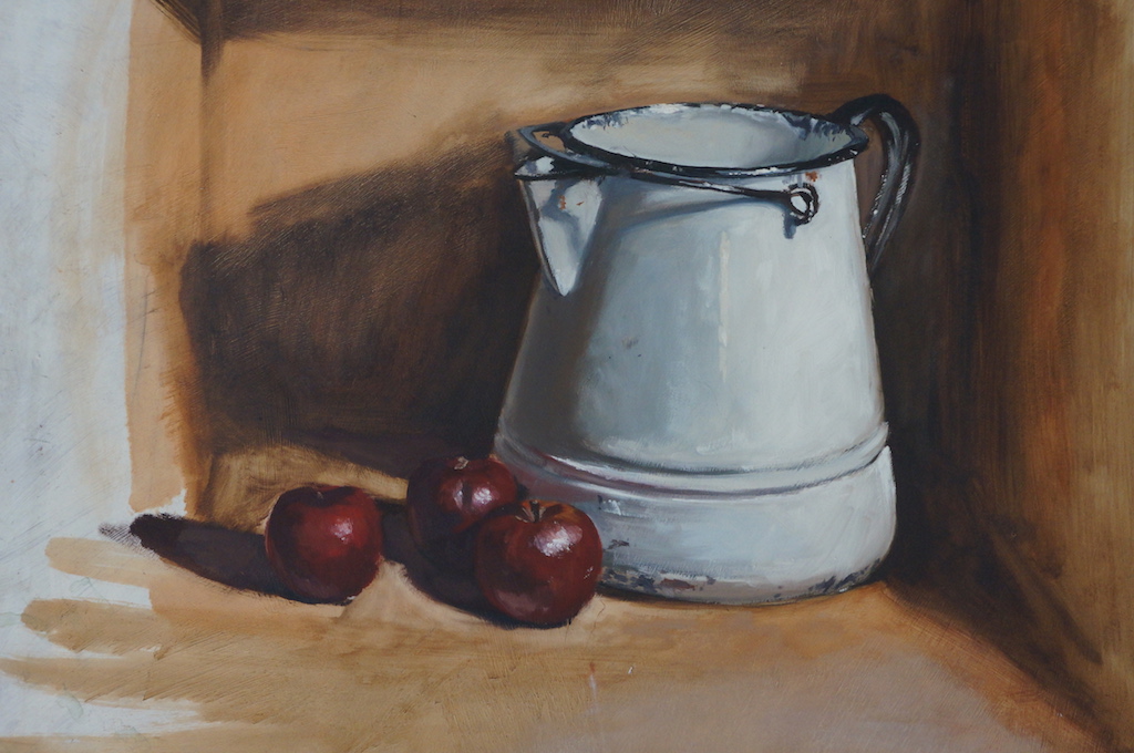
One day about five years ago I was going through a lot of stored work, both finished and unfinished, and tossing out really bad stuff. I pulled out one of the three, what I considered an unfinished oil on a Masonite panel, Still Life With Pitcher and Apples (below). I really can’t remember when I did it, but it must have been before they stopped making hardboard panels with the rough, deeply embossed “woven” pattern on the back.
My wife saw it and remarked how much she liked it and I kind of agreed with her (it was given to her as a Christmas gift and hangs over our couch). Based on this I decided to give oil paint another try. However, I needed to get a supply of paint, brushes, mediums and other oil-paint-specific items, so onto the Internet I went to do a little research.
I was happy to discover that there is now a water-miscible oil paint that uses a type of linseed oil that is modified to be thin-able with either water or solvent. This allows the paint to be thinned and cleaned up with plain water or mixed with traditional oils and thinned and cleaned up with solvents like mineral spirits. These paints were also touted to be much quicker drying than traditional oils, a vey attractive feature to me.
Oil Painting Inspirations
Having been away from oil paints for so long and not having much experience with them in the first place, I started looking online for some oil painting tutorials. That is one of the really great things about the internet, especially for artists — the incredible amount of instructional material available at the mere typing of a few keys on your computer keyboard. It was on Youtube that I discovered three wonderful oil painters, each of whom have free start-to-finish painting tutorials, offering great tips and techniques. I will introduce the three without images of their work since I have not sought permission to post them but the links provided will let you see the work and especially the video series of each one.
The first painter I found was Michael James Smith based in England. Currently, he has posted 171 free painting tutorials ranging from around 15 minutes to almost an hour each detailing his almost-photorealistic painting techniques. One of the main techniques I have gotten from watching his videos is that it is perfectly acceptable to do the underpainting for an oil using acrylic paint that dries quickly and allows you to get into the oil painting part much faster. He is also a master at introducing natural “randomness” — uneven spacing, varied shapes, angles, etc. — to features of his landscapes. Here is his Youtube channel: https://www.youtube.com/user/MichaelJamesSmithArt/
Another non-US painter that I think is wonderful is Andrew Tischler from New Zealand. He has a somewhat more limited series in terms of numbers of video tutorials than Michael James Smith, but he offers more information about palettes (range of colors as well as the physical palette), studio setup, a couple of plein air roadtrip videos and much more. His most important influence on me has been his emphasis of the importance of value and composition before even applying any paint to the canvas.
Finally, I recently discovered the Texas artist, Mark Carder. Previously well known as a portrait painter, he now seems to be more interested in realistic “alla-prima” (wet-into-wet) still life and occasional landscape as well as teaching. His painting method advocates for a very limited palette that, despite its few colors, can be mixed to produce almost any color and value. His website, http://www.drawmixpaint.com/, has a free complete oil painting course as well as 40 to 50 shorter specific topic videos. Some of these are wonderful “ask the artist” type sessions, with questions from his website visitors, that are really interesting.
I have a browser folder with a couple of dozen more great painters of various, mostly realistic styles that are inspiring to me, but the three above are notable for a couple of reasons. First, despite their obvious need and desire to make a living as working artists they have collectively worked thousands of hours to produce literally hundreds of video tutorials that can be freely watched by anyone. Second, their equally obvious passion for their work along with their generosity in sharing their passion is an inspiration in itself. Hopefully sometime in whatever number of years I’ve got left I hope I might meet them and thank them in person.
Thank you for reading! I hope you find these newsletter pieces interesting. If you are reading them on social media and would like to get them by email, please go to santhony.com to sign up as well as see some of my latest work, leave comments and read previous posts.
Instead of writing about the artists that currently inspire me that I had planned for this newsletter, I decided to first relate how I think location and medium (along with an exceptional artist) have been influences and inspiration over the 45 years since moving to this incredibly beautiful part of the country.
Location
My first painting medium was watercolor and, as I described in the last newsletter, my first inspirations were expert and well-known watercolorists, almost all of them at the time from the east coast. I collected books by famous west coast watercolorists like Millard Sheets and Rex Brandt who had lots of great tips and techniques to offer, but despite their great work, they were not as appealing to me as that of the easterners I admired.
Over those first three or four years after graduation from Dartmouth I was lucky to be able to see lots of superb work by other masters of the medium in books, shows and occasionally in galleries. In 1973, because I was selling some paintings and playing banjo steadily three nights a week, I was able to afford a six-month, two-days-a-week daytime watercolor workshop at the National Academy of Design in Manhattan with Mario Cooper, then president of the American Watercolor Society. Interestingly, Cooper won the Gold Medal of Honor in the annual AWS show during the period I happened to be attending the workshop. I tried searching for that painting to show one of the best of his works but without success. Aptly named Cormorants I think, it depicted a number of black cormorants standing on a pier with the foreground water painted almost identically to the water in San Trovaso below.
“San Trovaso” (1974) – Watercolor by Mario Cooper painted about the same time we moved from New Jersey to San Francisco.
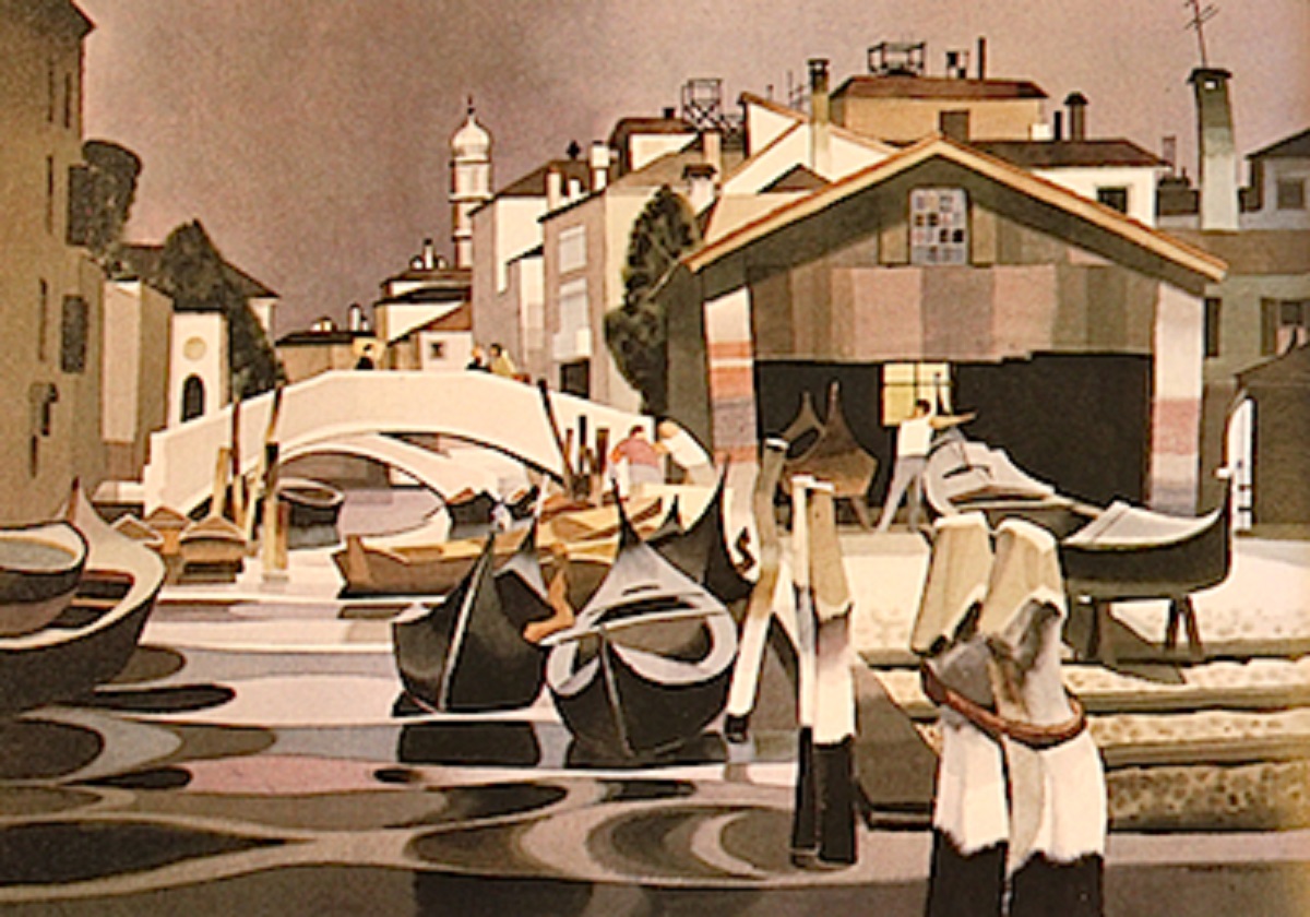
Cooper’s style was not what I was particularly interested in (plus he was a bit of an arrogant taskmaster), but his emphasis on composition and design and stylized technique did sink in, at least for a time. It seems to have somewhat shown up a couple of years later after moving to San Francisco when I painted The End Of Mission in addition to a couple of other paintings of buildings using a similar, not-entirely realistic, style. What I remember most after the six months was his mantra, “You should paint three kinds of paintings [in sequence] — one to sell, one to show, and one for yourself.”
The End Of Mission was probably “one to show.” The subject pictured is The Audiffred Building, one of the few buildings spared, by bribe no less, from dynamite following the 1906 San Francisco Earthquake — “…the Audiffred Building was saved [by] the bartender of the Bulkhead, the drinking establishment then occupying the building, bribed the firemen with the offer of two quarts of whiskey apiece and a fire cart full of bottles of wine.”
“The End Of Mission” 1974, watercolor.
Since my painting of it, the building has been completely renovated and now houses an upscale restaurant, Boulevard, and has offices on the two floors above. It is still a really interesting subject although I think its original dilapidated state was more attractive from an artistic point of view. An interesting side note is that five years after I painted this historic building and location I would be playing intermissions five-nights-a-week (from 1979 to 1982) for the Turk Murphy Jazz Band at Earthquake McGoon’s, whose location turned out to be the first floor of the Harbor Hotel at the far left of the painting! As for the painting itself, I unfortunately have no clue to where it now lives.
The move from New Jersey to San Francisco was almost certainly the greatest overall influence on my artwork to date, and the west coast is the greatest source of inspiration for me still. At first, however, the landscape and architecture were so different that it took a number of years before my west coast landscape paintings did not, “…look like New England” as John Pence of the John Pence Gallery told me when he turned me down for acceptance as one of his gallery artists. The lesson learned is that it usually takes awhile for the “feel” of a place to sink in and be reflected in an artist’s work. I think probably after this many years it finally has sunk in!
A New Medium and One Artist
I started painting with acrylics a year or so before moving to San Francisco. Although they had been available to artists for many years, they were new to me . Water-based acrylic paint provides the combined working properties of both watercolor and of oil with the benefit of fast drying (for impatient painters like I was at the time) and permanence — it can be layered without dissolving what’s underneath. Plus, the palette and brushes are easily cleaned up with water, so volatile, toxic and smelly solvents are unnecessary.
My first attempts were to use acrylic paint in a traditional watercolor technique since that was what I was most familiar with — thinned with lots of water on watercolor paper and leaving the white of the paper for the lightest values. The result of this technique is pretty much indistinguishable (at least from a distance — close up, acrylic dries with a bit of a sheen) from a traditional watercolor painting. I have to confess that I may have first tried them because acrylic paint is a lot cheaper than high quality watercolor paint for the amount of “real estate” that it covers . One drawback, however, is that once dry, acrylic artists’ paint cannot be re-wet for use like watercolor tube paint can be, so any left on the palette may be wasted. A workaround for this that I discovered and still use is to squeeze acrylic paint into wells in ice-cube trays and spray the paint lightly with water and cover the trays tightly between work sessions. The acrylic colors stay usable this way for a month or more.
Up For Repairs is an example of one of my early “acrylic watercolors.” I wish I could find it — I am pretty sure I have it stashed away somewhere!
“Up For Repairs” acrylic watercolor, 1973. One of my first acrylic-based watercolors.
I am not entirely sure why, but at some point I was inspired to overcome the purist watercolorists’ aversion to using opaque white paint and I tried the completely different and conceptually opposite technique of using acrylic like an extremely fast-drying version of opaque oil paint. I say “opposite” because, In general, watercolor uses the white of the paper for the lightest values and mostly progresses from light to dark. Opaque media like acrylic and oil, again in general with exceptions, are the opposite in that a painting progresses from dark to light. This influence of the medium is profound.
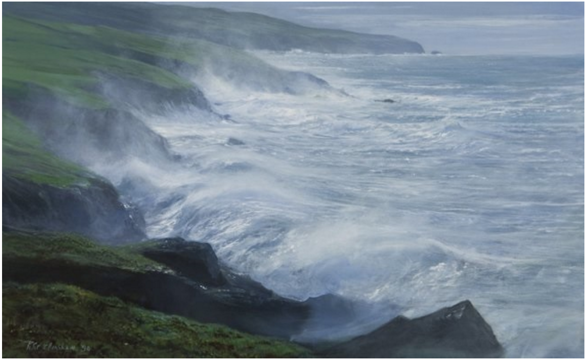
This switch in (or actually additional) technique and approach was probably triggered by seeing the spectacular paintings of Ireland by Peter Ellenshaw (1913-2007) at a show of his at the Connacher Gallery in San Francisco, probably around 1976. Ellenshaw’s large acrylics, especially those of the Irish coast, were awe inspiring to me at the time. I am fairly certain that Kerry Coastline below was one of the paintings in the show. It was huge as I remember, probably at least 48″ wide. Up close, the paintings were very impressionistic with seemingly random dashes, dots, slashes and other marks, but at a distance these textures merged into powerful, almost photographic realism. And, true to the opaque acrylic medium he used, the paintings were obviously built from dark to light.
“Kerry Coastline” by Peter Ellenshaw.
An Enhanced Medium
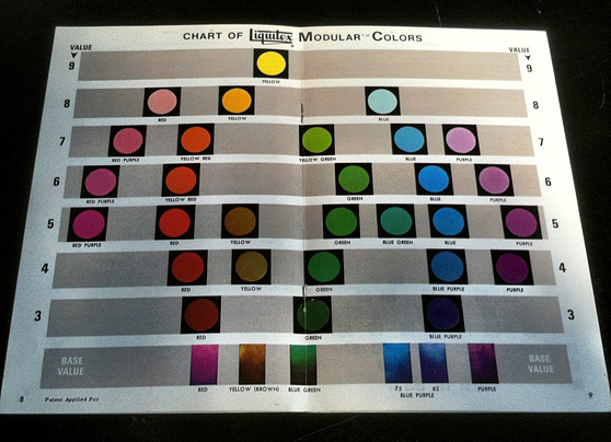
Just before moving to San Francisco I saw an ad in American Artist magazine for a new range of Liquitex acrylic colors, their Modular Color System (MCS). The MCS provided a complete range of colors pre-mixed with white in discrete levels of dark to light value. This system eliminated guesswork in value relationships and made “dirty” colors, that often happen when pure colors of different values are mixed, a thing of the past.
Color chart of the Liquitex Modular Color System range of acrylic paints.
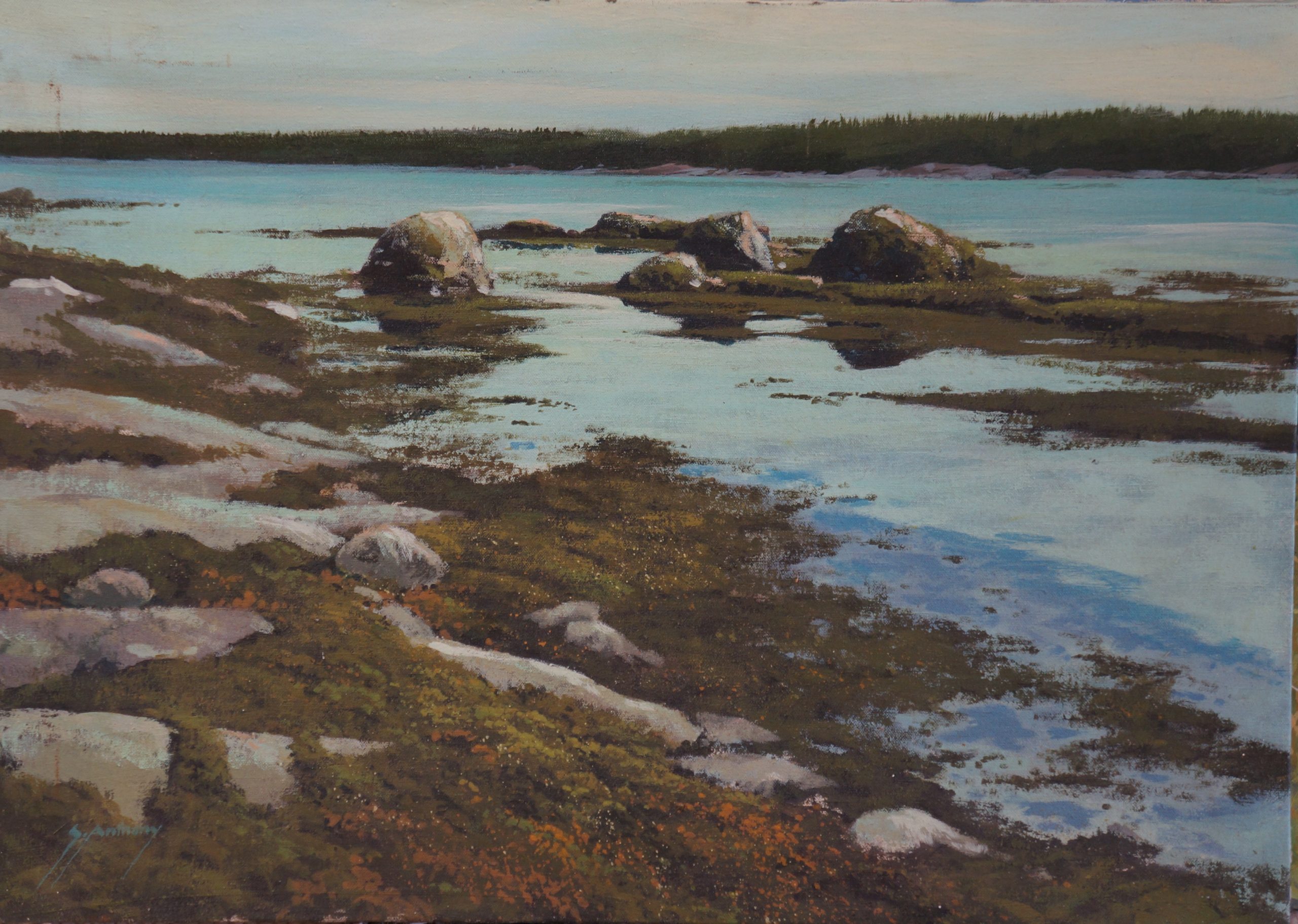
I did a number of acrylic paintings on canvas using the new Liquitex MCS. For quite a few years in San Francisco, even while attempting to make my paintings look less “eastern,” I was still drawing on hundreds of sketches and slides from back East and “Down East” Maine for subject matter. Low Tide Vinalhaven is one of them (and is available if anyone is interested in it).
“Low Tide Vinalhaven” acrylic on canvas, 18″ x 24″
I continued painting using both watercolor and acrylic (mostly Liquitex MCS paints) until the mid-1980s when a number of circumstances interrupted the flow. Thankfully, music and then computer programming filled the resulting time-gap, a gap that after almost 20 years has been followed by new inspirations to be described next time.
Thank you for reading! I hope you find these pieces interesting. If you are reading these newletters on social media and would like to get them by email, please go to santhony.com to sign up and/or see some of my latest work, leave comments and see previous posts.
Like all artists I know, I originally and continue to be inspired by the work of other artists that I admire.
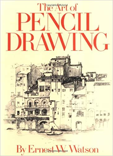
The first of these that I can recall was sometime around 1967 when I was absolutely enthralled by the 3-book instruction series on pencil drawing by Ernest W. Watson (1884-1969). I was fascinated by the incredible realistic renderings of buildings and landscapes that he produced with just a common pencil. By the way, thinking back while writing this, I realize that I have to “blame” the Dartmouth Bookstore for sparking my art career, I am pretty sure, with the purchase of this first instruction book set.
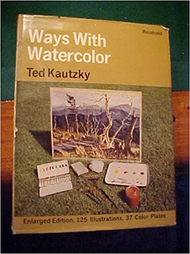
Very soon after discovering Watson, probably on a nearby slot on the bookstore’s shelves, I found a similar pencil instruction book by another artist, Ted Kautzky, called Pencil Broadsides (which refers to his use of wide carpenter pencils). Also nearby were Kautzky’s watercolor instruction books. I took one look at his Ways With Watercolor and was hooked. This was the start of spending practically all the little money I was making playing banjo with the Dartmouth Five to add to my collection of watercolor books. I pored over watercolor technique and the examples in Kautsky’s books and absorbed all I could.
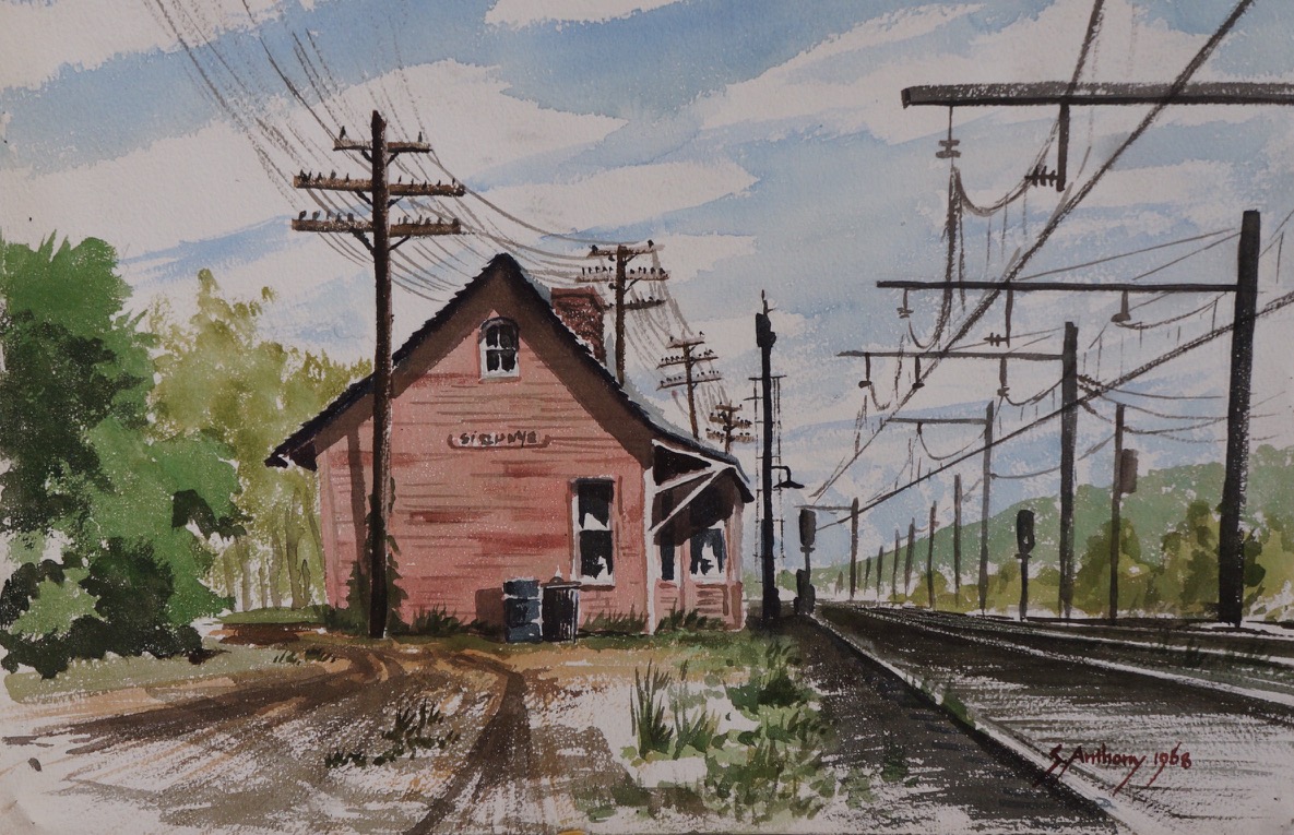
I recently found what I think was my first fairly decent but primitive watercolor, dated 1968. It definitely has a “Kautzky-esque” feel to it.
The visits to the bookstore kept revealing more fabulous watercolorists. They began to add more of the art, especially landscape, instruction books published by Watson-Guptill (the same Watson as above) by Philip Jamison,Richard Schmid and many others. Besides these books, I started a subscription to the no longer available American Artist magazine whose issues introduced me to a whole new world of inspiration, especially since the magazine seemed to somewhat favor realism, an art form definitely not in “favor” at the time.
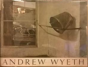
Then 1968 introduced me (and lots of other people) to the artist and the book Andrew Wyeth. The book with its large, “coffee-table” format allowed for the reproduction of over 100 of his paintings, especially the brilliant watercolors, in wonderful detail. I was amazed at how, out of a seeming mess of wet watercolor paint, he could make realistic images emerge. My original copy is pretty ragged right now after enduring thousands of thumb-throughs, multiple moves, young children leafing through it and loss of its dustcover. At least it did not suffer the fate of what I heard was that of literally most copies of the first printing — pages were cut out and the images framed, obviously destroying the books in the process! Ah, the power of greed.
Wyeth certainly inspired me, but mostly to loosen up a bit, paint “wet” with lots of paint and, unlike many watercolorists, to not be afraid of strong contrasts and dark values. While I don’t think that my work then or now really emulates Andrew Wyeth, if someone ever tells me they think my paintings look like his, I am certainly not offended (as opposed to being compared to another realistic painter I will not name). But I think the main influence was Wyeth’s work allowed realism to become once again accepted as a valid art form and that when I started painting I was bucking up against the prevailing non-realist trends.
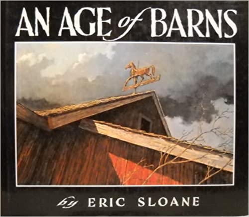
Around this same time another influence was Eric Sloane. Sloane originally published, among other titles, a number of books of sketches, diagrams and drawings of Early Americana, items like utensils, hardware, tools, even the weather (not exactly “Early American”), followed by a book of brilliant oil paintings of American barns. In this book I was particularly impressed by his dramatic lighting and composition. A lot of what I was painting during those last two years of college in New Hampshire were landscapes featuring barns or other old buildings, so An Age of Barns was certainly an influence on how I was seeing and painting these old structures. I am glad I concentrated on them at that time because they were beginning to disappear, many torn down to salvage old barn-wood, and replaced by mostly new metal structures with much less visual appeal.
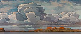
Following a lifelong interest and expertise in meteorology and observation of weather, one of Eric Sloane’s final works before his death was the sky-scape mural, Earth Flight Environment in the Smithsonian Air and Space Museum.
Enough for now. Next time I hope to highlight some of the painters I now find inspiring (or whom I may have forgotten here) have influenced my art journey for the last 50 years and continue to do so to this day.
If you are seeing this post on Facebook or other social media and would like to receive my newsletter by email, please go to https://santhony.com and sign up. You can also post comments there on every post or page.
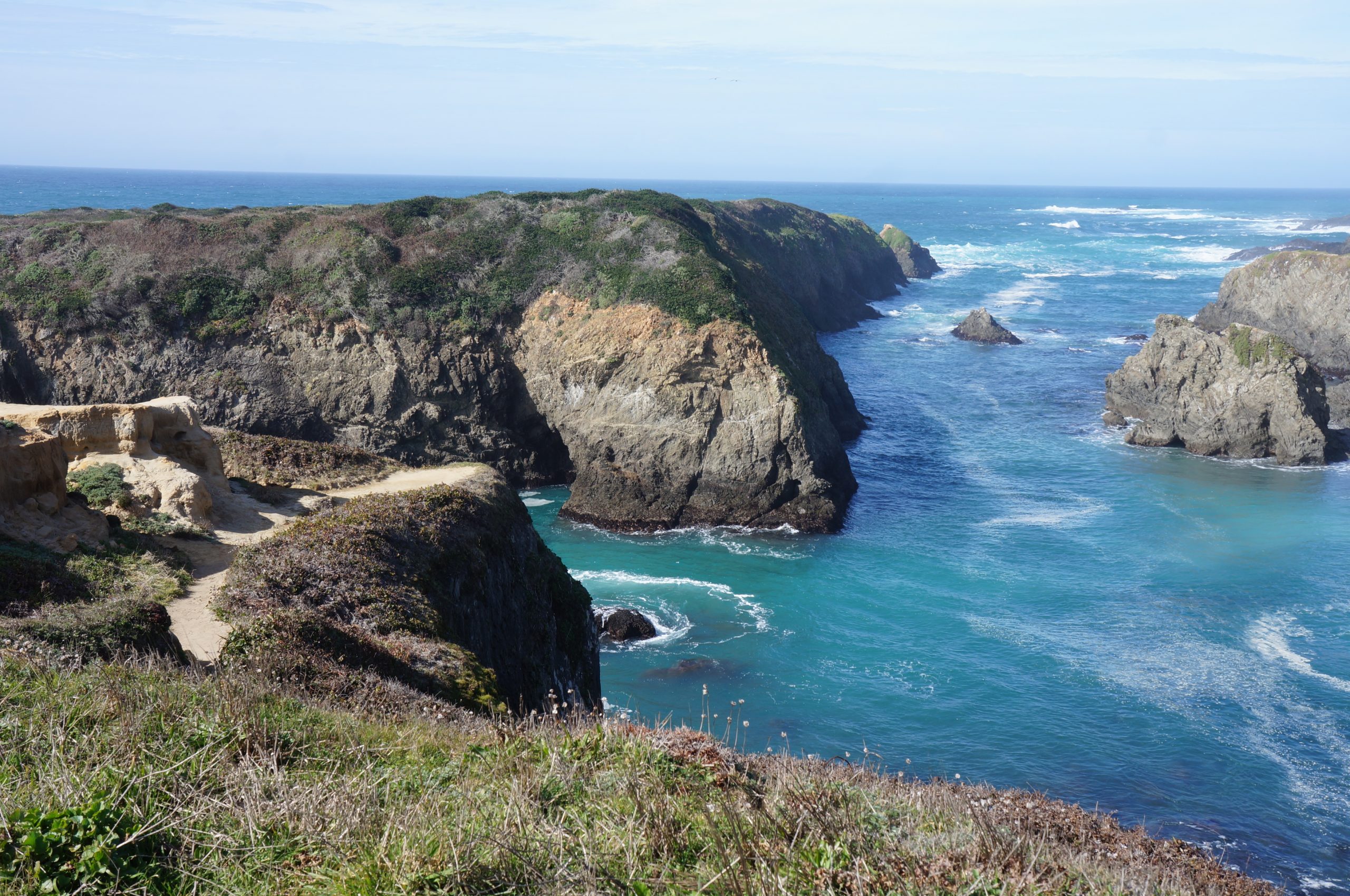
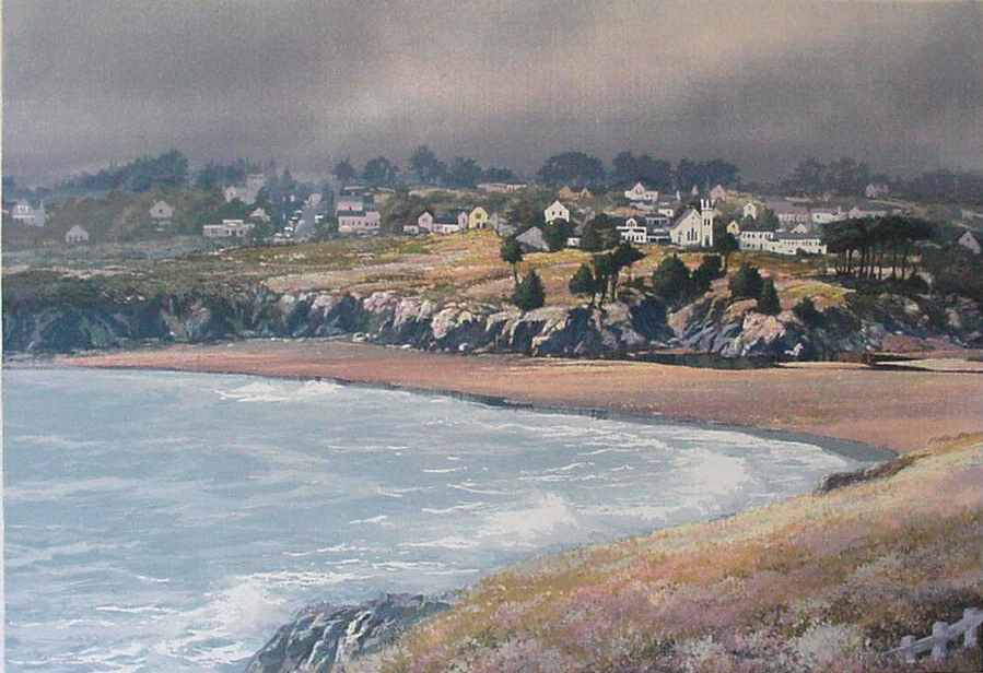
As a Christmas gift to ourselves last December, I booked a 4-day stay in the wonderful historic and scenic town of Mendocino, scheduled for mid-February. For those of you who are unfamiliar with it, Mendocino is about 140 miles north of San Francisco, and is perched on headlands overlooking Mendocino Bay and the Pacific beyond. The views just from the main street are spectacular and the town is almost surrounded by the Mendocino Headlands State Park where short trails lead to even more.
Just one of the spectacular views from Mendocino Headlands State Park.
As usual for a trip up there, I gathered together a portfolio of photos of some recent work to show gallery owners in an attempt to persuade one to take me on as one of their artists. Rejection is the norm because virtually every gallery is “full” and it is very rare one of them would have the physical or business space to take on another artist. In the case of Mendocino, this has always been a long-shot because there were only two or three galleries in the first place where my work would fit in and in the past each one was representing all the artists they could possibly handle.
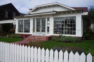
The Prentice Gallery, 45050 Main St, Mendocino, CA 95460
The first day, walking around exploring the downtown shops, I was quite disappointed that a couple of galleries I had thought might be possibilities seemed to be out of business. They were just plain gone! The final one I had actually not even remembered (it turns out it had merely moved to a new location). It was set back from the main street with a beautifully kept front courtyard with a white picket fence and gate along the sidewalk and greeted visitors with a bright, sunny front porch entrance. As we walked through the front door, the quality of work was immediately obvious — really high quality paintings, stained glass, ceramics, sculpture, jewelry and woodwork. I thought to myself, “This is where I want to be.”
The next part has always been awkward both for me and a prospective gallery owner. It is generally a short back and forth almost always ending with something like, “We are completely full right now, but we will keep you in mind if a space opens up.” It seemed apparent that they liked my work, but the ultimate response was the same as usual. However, something seemed a little different this time. The owner, Lynne Prentice, seemed puzzled about something, like she thought she might have heard my name or seen my work somewhere before. At any rate, Karen and I left after really marveling at a lot of the wonderful work being shown and continued exploring the downtown shops, disappointed but not very surprised.
“Mendocino” silkscreen print, 1980
Fully a half-hour after leaving the gallery my cellphone buzzed. I saw it was from the gallery and answered and heard Lynne say, “I know where I’ve seen your work! A client from Florida sent us a silkscreen print of yours of Mendocino for us to sell on consignment. Yes, we definitely would like to have your work in the gallery!”
At last, a “YES!”
Just before my birthday in March, ignorant of the Corona virus at the time, Karen and I loaded the car with almost 20 acrylics and oils (and a few silkscreen prints) and drove them up to Mendocino to the Prentice Gallery. I will happily be joining a wonderful group of other artists and craftspeople. Of course, as luck would have it, immediately after leaving all my pieces and getting home to Pacifica on March 15, the gallery had to close due to Covid-19, but today Lynne is “virtual re-opening” with a newly designed website and will be physically open limited hours from 12 noon to 3pm on Thursdays, Fridays and Saturdays for the time being. Please check out all the great artwork at the new gallery website. I am sure you will really enjoy it!
If you are seeing this post on Facebook or other social media and would like to receive my newsletter by email, go to https://santhony.com and sign up.
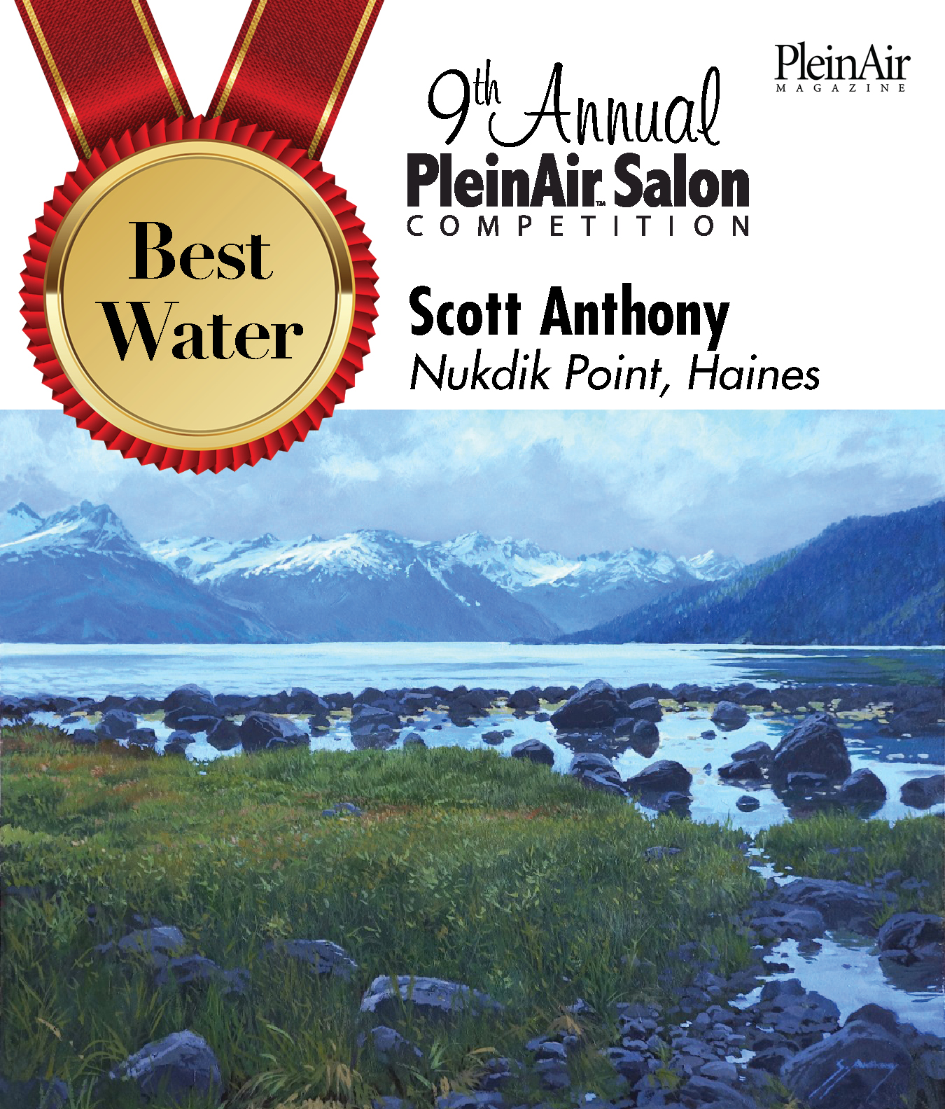
A year ago this month Karen and I were on a wonderful 21-day Holland America cruise to Alaska. We had been especially interested in this particular cruise itinerary because it included a number of ports that we had never before visited, including the Borough of Haines, a picturesque small town that is an alternate port to Skagway, which is a ferry-ride away.
We normally like to explore most ports on our own, but luckily we booked an excursion in Haines billed as “Nature Photography” or something to that effect. When we got down the gangway and walked to the excursion meeting area on the pier we were greeted by a really friendly tour guide and professional photographer, Cindy Schultz (be sure to check out her work here), who led the group of a dozen or so of us to her van and off we went.
Cindy took us to four of her favorite nearby locations north of town along Lutak Road that follows the Chillkoot River and ends at the incredibly beautiful Chillkoot Lake. On the return we stopped and spent a half-hour or so just outside town at Nukdik Point where I got more good camera shots to be used as painting source material. Karen and I agreed that the tour was absolutely the most enjoyable of all from the many cruises we have been on, in no small part because of Cindy, her knowledge of the area and her enthusiastic guidance.
Two days ago on Monday morning I opened my email and, after deleting about 25 campaign fund-raising requests and a bunch of “Senior” targeted spam emails, I was delighted to be presented with a message featuring the image below. The winning piece is an oil, the second of my Alaska paintings since returning from the cruise, and the award notice is almost exactly one year since we were standing in that exact spot.